Popover
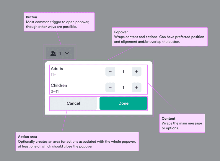
Keeps additional content easily accessible while not cluttering up the page.
- To keep small bits content off of the initial screen but still only a tap away.
- For short content or interactions that aren’t necessary to the main flow.
- For content that still might interest users and can be revealed through progressive disclosure.
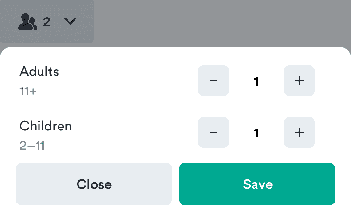
- To add interactions or choices in the context of the current screen.
- For large and/or structured content—use a modal.
- To interrupt the main flow—use a modal or dialog.
- For one choice less related to the current screen—use a dialog.
- For static, short information—use a tooltip.
- To add hidden information to the screen itself—use a collapse.
Released | Released | n/a | n/a | Released |

Since popovers necessarily hide information from the initial screen, users need to know how they can get to that information.
A common way to do this is a button with a chevron down icon on the right. This makes it clear that more information can pop down below the button.
Popovers have limited space outside the main flow. This means they’re best for resolving single issues, not many things at once.

Do
Focus on important actions.

Don't
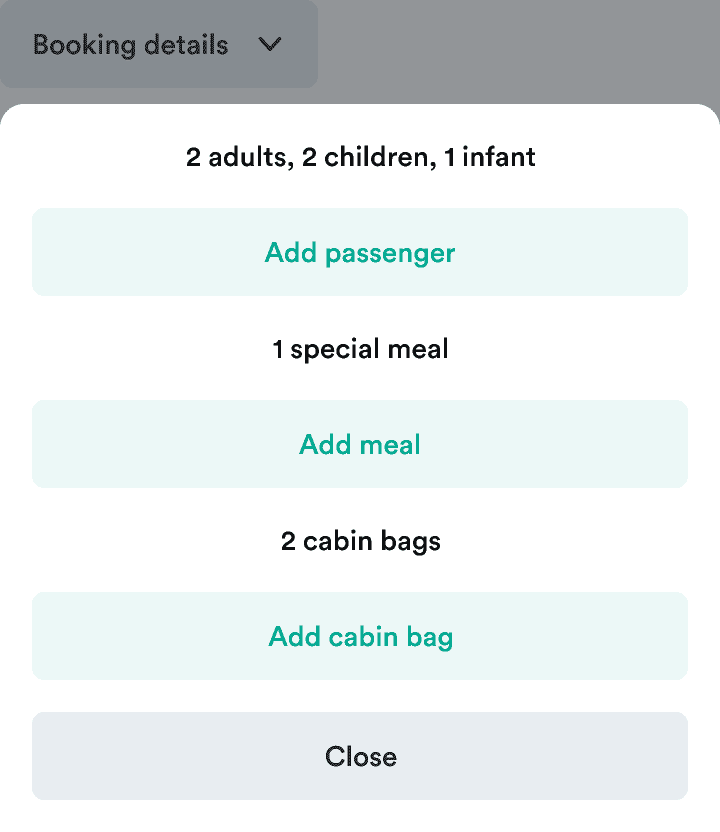
Don’t include everything users can do at once.
Popovers present extra information or choices in a limited space. Don’t overwhelm your users with information.