ButtonGroup
Groups multiple related actions a user can take.
If you’re unsure what component or type to use for actions, check out our interactive guide on action components.
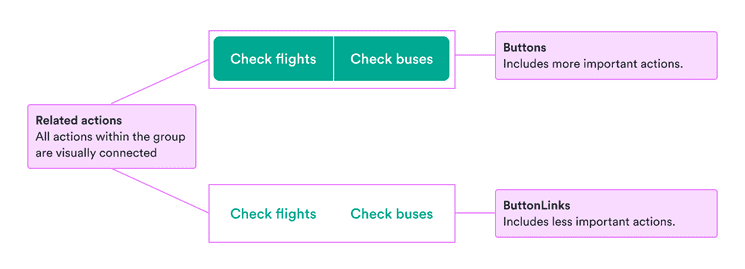
- To group several actions with similar purposes.
- If the actions are important, fill the group with buttons.
- If the actions are less important, fill the group with button links.
- When you have too many actions—separate them so as not to overwhelm users.
- When the actions are more complex and have structure—use a tile group.
n/a | Released | n/a | n/a | Released |

Button groups remove many visual clues that there are multiple actions, such as spacing and border radiuses on buttons. This makes them great at presenting a united visual.
It also makes it more difficult for users to distinguish that there are multiple actions. So only use them for actions that clearly relate to one another.
Make sure to follow the guidelines for whatever components you’re using within the group, buttons or button links. See our interactive guide on choosing the right component for your actions.