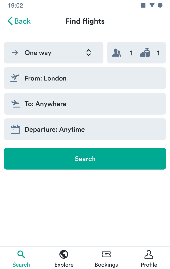
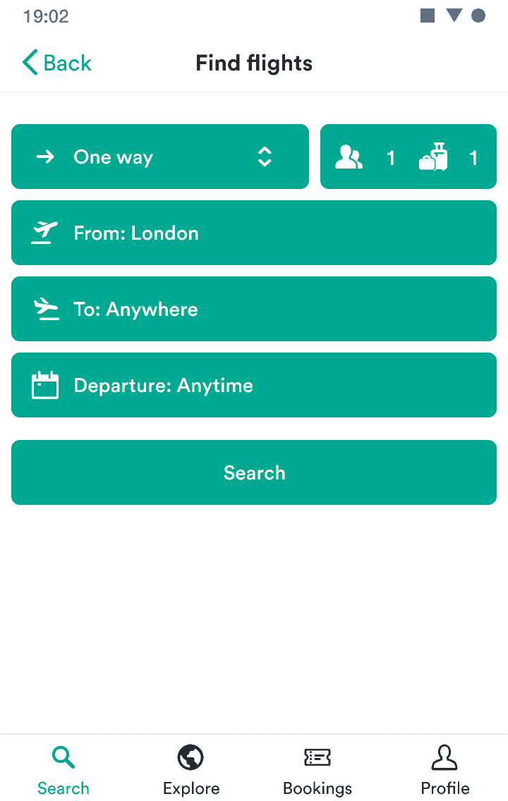
Button
Displays a single important action a user can take.
If you’re unsure what component or type to use for actions, check out our interactive guide on action components.
- To offer the most important actions users can take.
- When you have many actions at once—use a button link.
- You want to offer a less important action—use a button link.
- To make text inside paragraphs or lists actionable—use a text link.
- So users can sign in using a social service—use a SocialButton.
Released | Released | Released | Released | Released |

If everything looks important, then nothing is important.
—Patrick Lencioni
Users need to be certain of what action to take next. You need to know which actions are the most important within a given section of the user flow.
Once you’ve identified which actions are the most important at the moment, you can indicate importance through size, type, and variation.
Many designers want to show users that actions will be possible in the future, so they end up using disabled buttons to show potential actions. But such buttons often end up confusing users about what’s possible.
Instead, try to focus on using progressive disclosure to show them only the actions they should take right at the moment. Then when it’s possible for them to take action, you can show them more buttons.
If you need to use a disabled button, always make it clear how users can activate it, such as with a tooltip.
It should be clear from the button text exactly what happens when the user interacts with it. The labels should be actionable, such as “Add passenger” and “Book for (price)“.
Avoid long explanations in the button text. The text should be short and clear. If additional explanation is needed, add it above the button as text.
See examples for how to make actions clear.
While your first instinct on mobile devices might be to use smaller buttons and button links to take up less valuable space, this actually creates some issues. For example, placing a small button on one side of the screen makes it much harder to access for people using one hand (a button on the right is hard for left-handers to access).
Also, without clues like hover states, interactions in mobile devices are harder for users to guess.
So on small screens, buttons and button links should take up the full width. This makes them easy to access and hard to miss.
On wider screens, users are unlikely to be using only one hand and are used to hovering to find interactions. So buttons and button links can fit the size of their content.
Buttons come in three sizes (large, normal, and small) and three types (primary, secondary, and critical). Two of these types (primary and critical) also have subtle versions in lighter shades to show actions that don’t draw as much attention.
Primary buttons are best for the single primary action on the screen. Critical buttons work for destructive actions—actions users can’t take back. All remaining actions can be secondary buttons or another component.
Buttons with icons are great when you need to draw more attention to the action. Icons add additional context and makes the buttons more easy to scan.
But it’s essential to not overuse these buttons. If everything is grabbing attention, things usually get messy.
All of our buttons use a consistently defined set of states.
- Hover – We change the background of a button to its :hover color.
- Active – We scale down the button with the modifierScaleButtonActive design token and also change the background to its :active color.
- Focus – The background stays same but the button gets a box shadow with the color and opacity determined by the button type.
- Disabled – We change the button opacity with the opacityButtonDisabled design token. This deactivates all the states listed above.

